
Flexx
CASE STUDY

brief
Given the prevalence of wearable technologies and activity-tracking products, the fitness industry is experiencing large-scale disruption. However, despite the availability of personal metrics, people continue to struggle to maintain a healthy lifestyle. Our team was tasked with creating a digital product that reimagines how people can adopt and maintain a healthy lifestyle in this saturated market.
research
In such broad context, we approached our challenge by casting a wide net, and narrowed in on trends and patterns as we dug deeper. We conducted a series of fitness focused interviews among the 18-34 year old demographic. Our synthesis immediately showed emerging trends between sexes, and our direction began to take shape. This in itself was not surprising, but we were much more interested in why.
We discovered 3 recurring reasons why women specifically were turned off from going to the gym to work out.

Misinformation
People are so inundated with fitness articles and health advice, that they don’t know who to trust or what to believe.
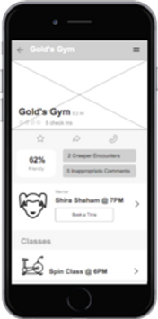
Harassment
The fear of being bothered at the gym is a huge contributor towards avoiding it altogether.
No support
Friends and family are the biggest fitness motivators, but many people haven’t found a platform that works well to motivate them through positive encouragement.
competitive analysis
We then turned to our competitors to pinpoint current market trends towards which users responded well, while also gleaning crucial insights into their flaws. We looked at 11 competitors, categorizing them by sector.
Studying their specializations within the fitness market, as well as their target users and customer loyalty rankings, we found that nobody was addressing gym intimidation head on. The struggle in this phase of our challenge was analyzing a space rampant with competition and finding a niche where we could differentiate our product in a meaningful way. Our decision to target a very specific problem within the female demographic proved worthwhile.

empathize
We identified 2 distinct user personas for whom we could design within our target demographic. One was a fitness novice with the common reservations caused by gym intimidation. The other was an avid gym-goer, seeking a more social experience.

The challenge here was to find a way to target our primary persona while also addressing the motivations of our 2nd persona. We mapped out a typical week for our primary user, which helped us realize our user’s ever-fluctuating workout motivations. Our goal moving forward was to offer a consistent motivator that would alter our user’s perception of working out.

Problem Statement
The gym-going experience can often be physically and mentally intimidating for women. How can we create a supportive community that eases these concerns so that women can be confident about approaching fitness in a fun and comfortable way?
design principles
01
Community
A safe and friendly environment to confront social intimidations head-on. A platform to encourage content sharing
02
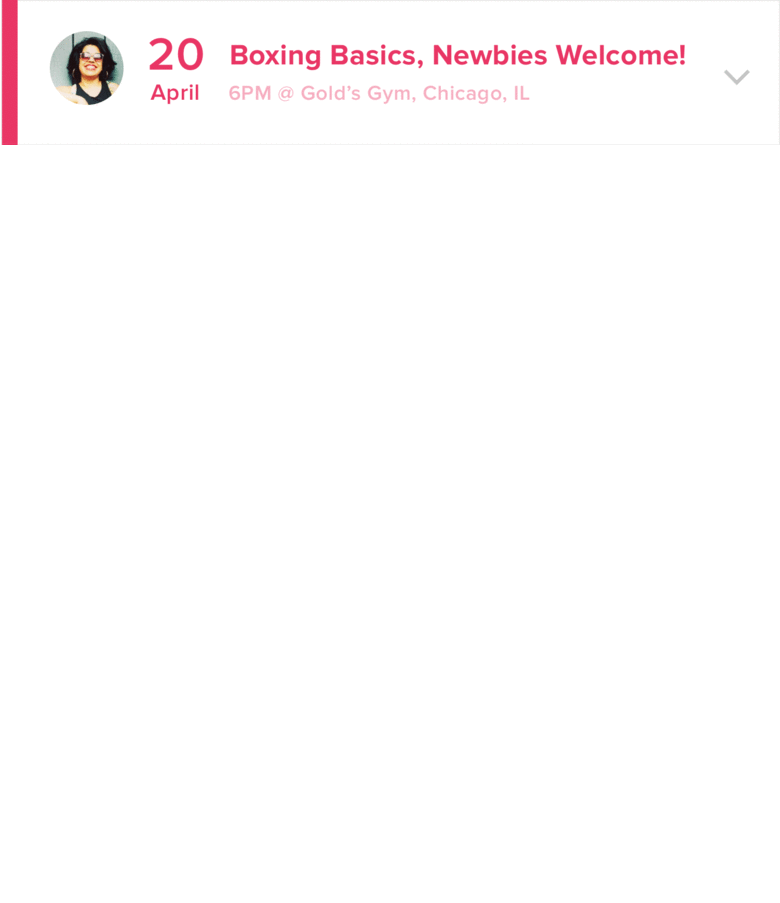
mentorship
A core principle emphasized to inspire and motivate users
03
gratification
We simply want users to feel good about using our product, which in turn translates into a positive reaction to fitness
04
inclusive feminism
Our product is for all types of women of all fitness levels. While designing for a feminine aesthetic, we were careful to avoid cliche
ideate
Through concept testing, we discovered that users responded well to our one solution that embraced the gym experience rather than circumventing it. We moved forward with flexx, a mentor-based idea to connect novice and experienced members in the female fitness community. With this, we simultaneously addressed the overlapping motivations of both our user personas.
Tested Poorly

Tested Well
prototype
We conducted further research to validate our assumptions about the inherent benefits of community and mentorship and how they would apply to our solution. We looked at specific elements such as language and information architecture that social media giants use to build customer loyalty. We also studied the effects of mentorship programs in the 71% of Fortune 500 companies that use them to great effect, and applied them to our platform.
Good
-
Concept validated
-
Motivation improved
-
Mentorship well-received
-
Good feedback on social components
Bad
-
What is the app's primary purpose?
-
Who are the mentors?
-
What is the primary task?
-
Needs more functional flexibility
Changes
-
Thorough onboarding
-
Clear navigation
-
Updated task flows and IA
-
Sorting by activity or schedule
We were careful and deliberate with how we structured our app flows. Regardless of the type of user, we wanted them to be able to book a mentor through a variety of avenues. Casual browsers could navigate to the booking through the feed, users who knew what they wanted could use direct search, and those on a tight schedule could use the schedule function.

bringing it to life
The goal of this phase was to make our product beautiful while adhering to the core design principles of our concept. We revisited out competitors once again to see what aesthetic styles were working well. We experimented with 8 unique styles and narrowed it down to two. The challenge was to blend the lively color palette of one of our style tiles with the clean and intricate layout of our other.


We paid particularly close attention to our use of language in order to give our app a familiar and encouraging personality. With gratification being the core emotional value of our product, we incorporated elements into our design that would evoke a sense of accomplishment to our user. Through carefully selected language, delightful microinteractions, and frequent positive reinforcement, our users would simply feel good about using our product. Ultimately, the importance of cohesion and consistency in our design were the biggest takeaways from this stage in the process. Every iteration became cleaner, with a higher attention to detail each time.


usability testing
User testing validated the clean functionality of our product, as well as a high level of user engagement. We tested a sample group of 6 women with varying levels of fitness in their daily lives, and every one completed the task of booking a mentor without issue. In some cases, we instructed the users with a given task of booking the mentor through a particular page. In other cases, we allowed the users to navigate and discover the features on their own. In both scenarios, we were pleased to see 100% of our users book mentors without issue.
Overall, I understand the purpose of this app
93%
I'm comfortable with how the app is asking me to participate
93%
I would be interested in trying this app
80%
I would recommend this app to others
83%
I would use this app frequently
70%
I would use this app for an extended period of time
80%
I believe this app could help improve my fitness/health
87%
I believe this app would make me want to work out more often
87%
I believe this app offers a use that could benefit many people
83%
conclusion
Our concept was critiqued by industry professionals a number of times. Halfway through and at the end of our project, we presented to a panel of 4-5 judges from UX, UI, and development backgrounds. The judges were unanimously impressed with our work, and gave valuable insight for moving forward. The latest iteration laid nice groundwork for taking our concept to the next level. With additional user tests, we would be able to simplify the platform and whittle away any extraneous features and functionality.


final thoughts
Differentiation within the industry proved to be challenging at the onset of this project, but our team worked well to identify targeted goals. The problem statement we set out to solve was addressed in an effective manner, all while keeping both of our personas in mind.
My biggest takeaway from designing for a strictly female user was acknowledging the importance of empathy throughout the process. Putting myself in the mindset of the end user was vital, as I learned to keep my personal opinions separate from the raw research. Teamwork was incredibly important, as we were able to feed off of each other’s ideas, and complement one another’s skills nicely. Working on this project from inception through final UI deliverables expanded my skillset while deepening my appreciation for the iterative design process.